Changing Colours
It is possible to update the default theme with your colours to make it fit perfectly with your website by adding a palette property to the ThirdPartyEmailPassword.init call.
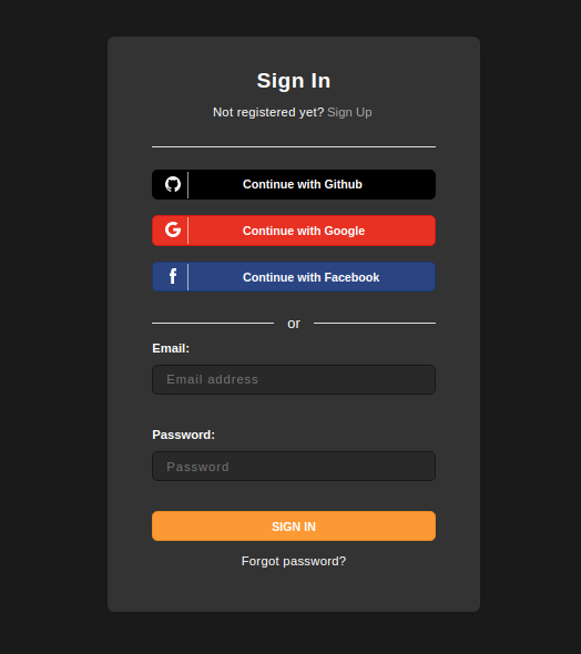
For example if your website uses a dark theme, here is how you can quickly customize it:
- ReactJS
- Angular
- Vue
- Plain JavaScript
- React Native
Note
You can use the
You can refer to this example app as a reference for using the
supertokens-web-js SDK which exposes several helper functions that query the APIs exposed by the SuperTokens backend SDK.You can refer to this example app as a reference for using the
supertokens-web-js SDK.Note
To use SuperTokens with React Native you need to use the
To add login functionality, you need to build your own UI and call the APIs exposed by the backend SDKs. You can find the API spec here
supertokens-react-native SDK. The SDK provides session management features.To add login functionality, you need to build your own UI and call the APIs exposed by the backend SDKs. You can find the API spec here
What type of UI are you using?
Prebuilt UICustom UI
What type of UI are you using?
Prebuilt UICustom UI
import SuperTokens from "supertokens-auth-react";import ThirdPartyEmailPassword from "supertokens-auth-react/recipe/thirdpartyemailpassword";import Session from "supertokens-auth-react/recipe/session";
SuperTokens.init({    appInfo: {        apiDomain: "...",        appName: "...",        websiteDomain: "..."    },    recipeList: [        ThirdPartyEmailPassword.init({            palette: {                background: '#333',                error: '#ad2e2e',                textTitle: "white",                textLabel: "white",                textInput: '#a9a9a9',                textPrimary: "white",                textLink: '#a9a9a9',                // ...            }        }),        Session.init()    ]});
important
Changes to the palette will apply to all the UI components we provide. If you want to change a specific component, please see this section.
Palette values#
background:#
- Description: This value represent the background color of all forms.
- Default:
"white"
inputBackground:#
- Description: This value represents the background color of the input fields of all forms.
- Default:
"#fafafa"(light grey)

primary:#
- Description: This value represents the primary color used for highlighting focussed inputs, display successful states and button background colour.
- Default:
"#ff9b33"(orange)

success:#
- Description: This value represents the color used on success events.
- Default:
"#41a700"(green)

error:#
- Description: This value represents the error color used for highlighting inputs with errors, and display error messages.
- Default:
"#ff1717"(red)

textTitle:#
- Description: This value represents the color of the title of each forms.
- Default:
"#222222"(black)

textLabel:#
- Description: This value represents the main color used for form fields labels.
- Default:
"#222222"(black)

textInput:#
- Description: This value represents the main color used for form fields labels.
- Default:
"#222222"(black)

textPrimary:#
- Description: This value represents the main color used for subtitles and footer text.
- Default:
"#656565"(grey)

textLink:#
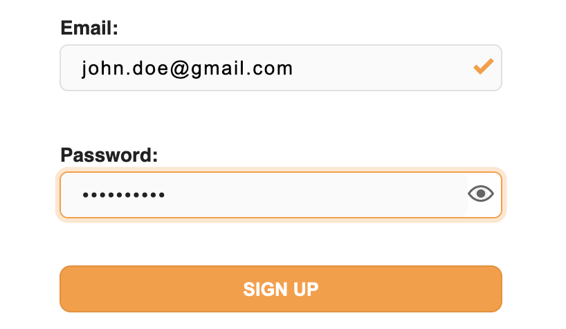
- Description: This value represents the color used for links (see the image above).
- Default:
"#0076ff"(blue)
buttonText:#
note
This value is only available for supertokens-auth-react version >= 0.18
- Description: This value represents the colour of the text inside the main button on each page
- Default:
"#ffffff"(white)

superTokensBrandingBackground:#
note
This value is only available for supertokens-auth-react version >= 0.18
- Description: This value controls the color of the SuperTokens branding element on the bottom of sign-in/up pages
- Default:
"#F2F5F6"(alice blue)
superTokensBrandingText:#
note
This value is only available for supertokens-auth-react version >= 0.18
- Description: This value controls the color of the "Powered by SuperTokens" text on the bottom of sign-in/up pages
- Default:
"#ADBDC4"(heather grey)

 supertokens-auth-react